
In a world obsessed with metrics, funnels, and algorithms, one invisible force quietly sabotages even the most beautifully crafted digital campaigns: cognitive load. It doesn’t matter how stunning your visuals are or how compelling your copy is—if your audience is overwhelmed, distracted, or confused, they won’t convert.
So what exactly is cognitive load, and why should digital marketers care?
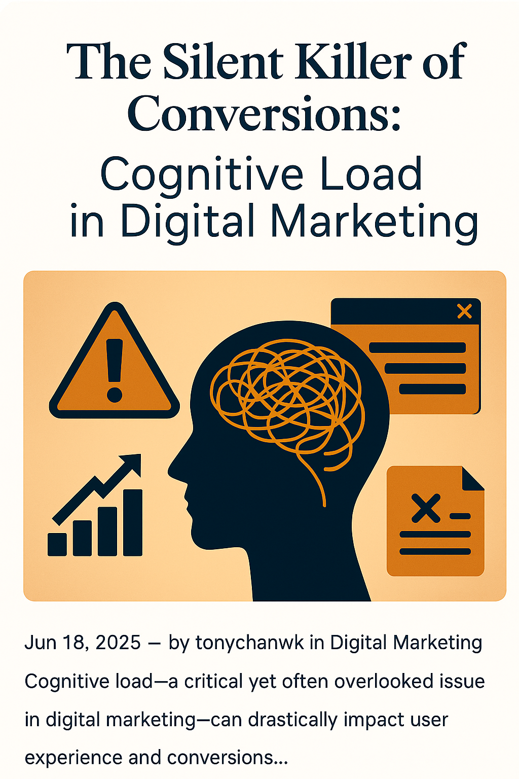
What Is Cognitive Load?
Cognitive load refers to the amount of mental effort required to process information at any given time. Our brains have limited bandwidth. When users are faced with too much text, too many buttons, or unclear navigation, they experience mental fatigue—and often abandon the task altogether.
Think about the last time you exited a website because it felt “too much.” That’s cognitive overload in action.
Why Marketers Often Overlook It
Marketers are trained to add—more features, more CTAs, more touchpoints. But rarely do we ask: Is this too much for the user to process right now?
We rely on analytics, but heatmaps and click-through rates can’t always capture why someone bounced. Cognitive friction is silent, subtle, and often invisible in your dashboard—but deadly to conversion.
Signs Your Campaign Is Suffering from High Cognitive Load
- 🚫 Users bounce quickly without scrolling or clicking
- 🔁 Too many steps before reaching the desired action
- 🧭 Confusing navigation or unclear next steps
- 🧱 Walls of text with little visual breathing room
- 📣 Multiple messages competing for attention at once
Real-World Examples
- A landing page that features three different CTAs (“Download,” “Get Demo,” “Learn More”) creates uncertainty.
- Product pages loaded with technical specs and jargon confuse non-expert users.
- A sign-up form that asks for eight fields of information before value is delivered increases abandonment rates.
How to Reduce Cognitive Load for Better Marketing Performance
1. Use Clear, Hierarchical Design
Prioritize content. One main message per screen. Use headings, subheadings, bullet points, and whitespace to guide attention.
2. Simplify Choices
Too many options cause paralysis. Offer the next logical step, not every possible one.
3. Limit Text
Short, skimmable copy wins. Break up paragraphs. Use visuals or infographics where possible.
4. Create Predictable Navigation
Keep menus clean. Don’t make users hunt. A consistent layout builds trust and familiarity.
5. Align Content with User Intent
Speak your audience’s language. Don’t flood them with features—highlight benefits that matter to them in the moment.
Design for Effortless Experience
Reducing cognitive load isn’t about “dumbing down” your marketing. It’s about respecting your audience’s time and attention. A seamless, intuitive user experience feels effortless—and effortless experiences convert.
Takeaway: Simplicity is Strategy
The next time you analyze performance metrics, ask: Are we trying too hard to say everything at once?
Sometimes, the most powerful thing a digital marketer can do is to remove—not add.
Less confusion. Less friction. More clarity. More conversions.
Leave a Reply